
Cereal Box Design
What I Used
Illustrator
Used to create all vector illustrations, including the cereal characters, lotería icons, and decorative packaging elements.
Indesign
Used to build the full dieline layout and manage type hierarchy, nutrition panel formatting, and print specifications.
Color Theory
Used a bold, warm palette inspired by Día de los Muertos offerings—combining tradition, playfulness, and nostalgic contrast.
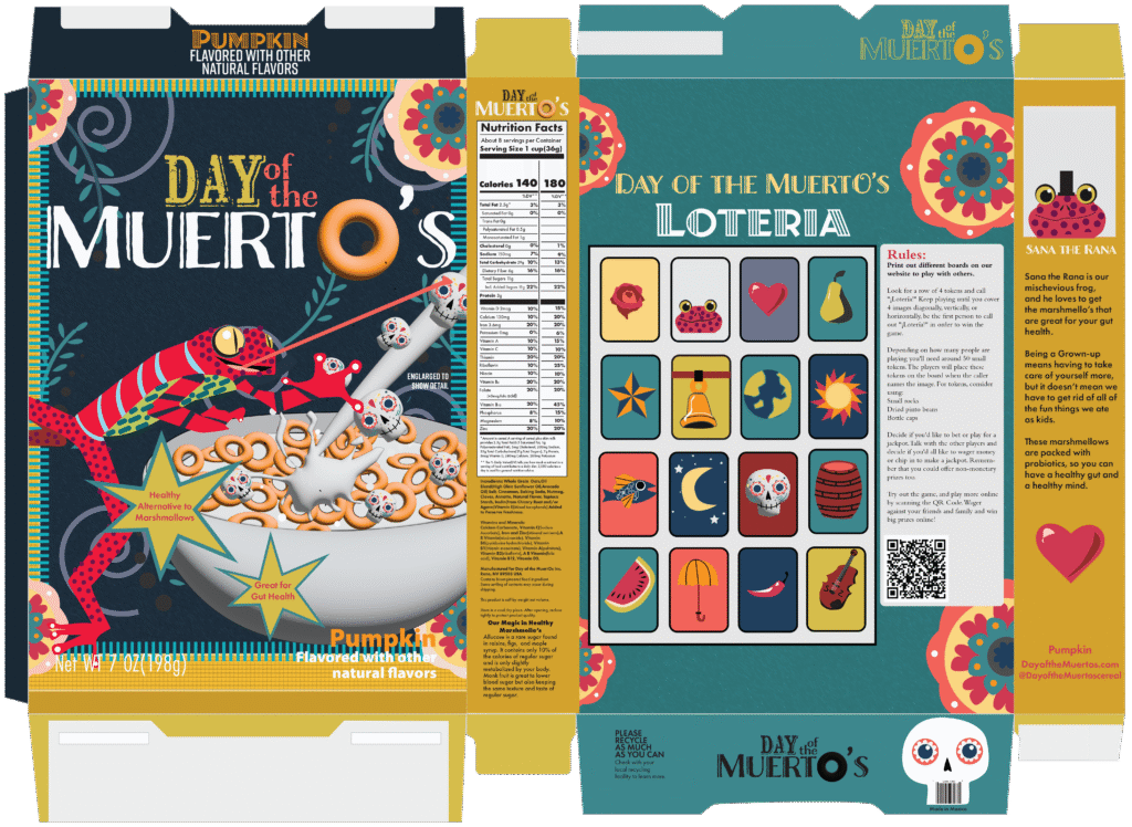
Day of the Muerto’s
This cereal concept is rooted in nostalgia, designed for adults who still crave the marshmallows but now have to think about their health. It’s pumpkin-flavored—sweet like the treats offered on Día de los Muertos—but made with gut-friendly, probiotic marshmallows that feel both playful and mindful.
The back of the box features a custom Lotería game so families can connect, laugh, and honor the tradition together. A QR code links to downloadable cards and extra versions to make the game feel complete—bringing generations together through food, memory, and play.
This design combines cultural storytelling with product design, reflecting the tension between childhood indulgence and adult responsibility, all while celebrating life, remembrance, and joy