Used to create clean vector artwork and custom icons for each card.
Indesign
Used to create the format of the brochure, and have it printed.
Color Theory
Used warm/cool contrasts and band-related palette for mood and nostalgia.
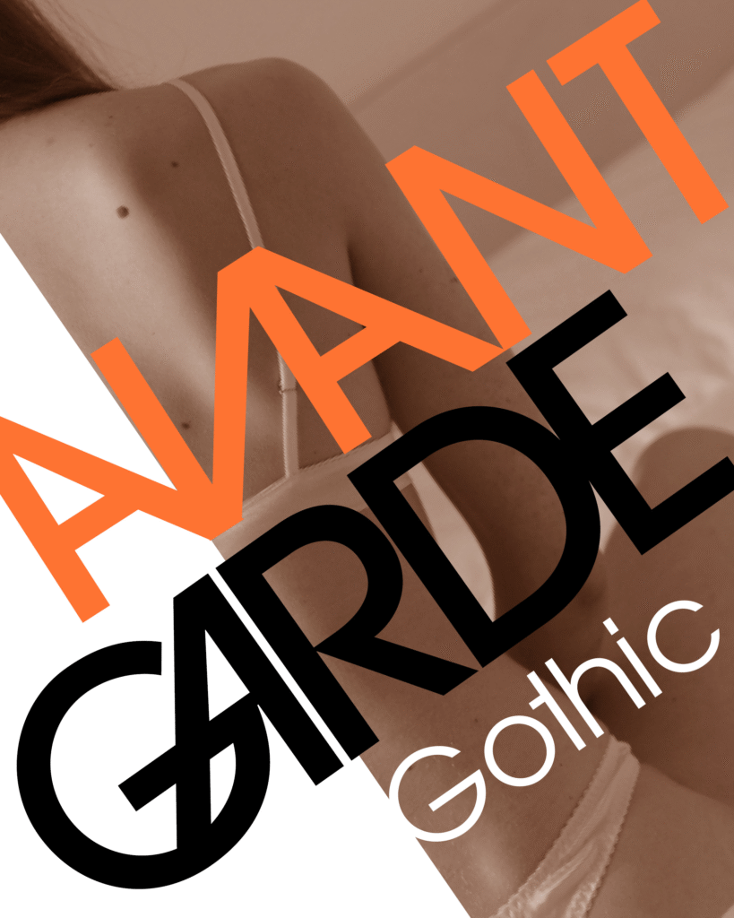
Avant Garde Brochure
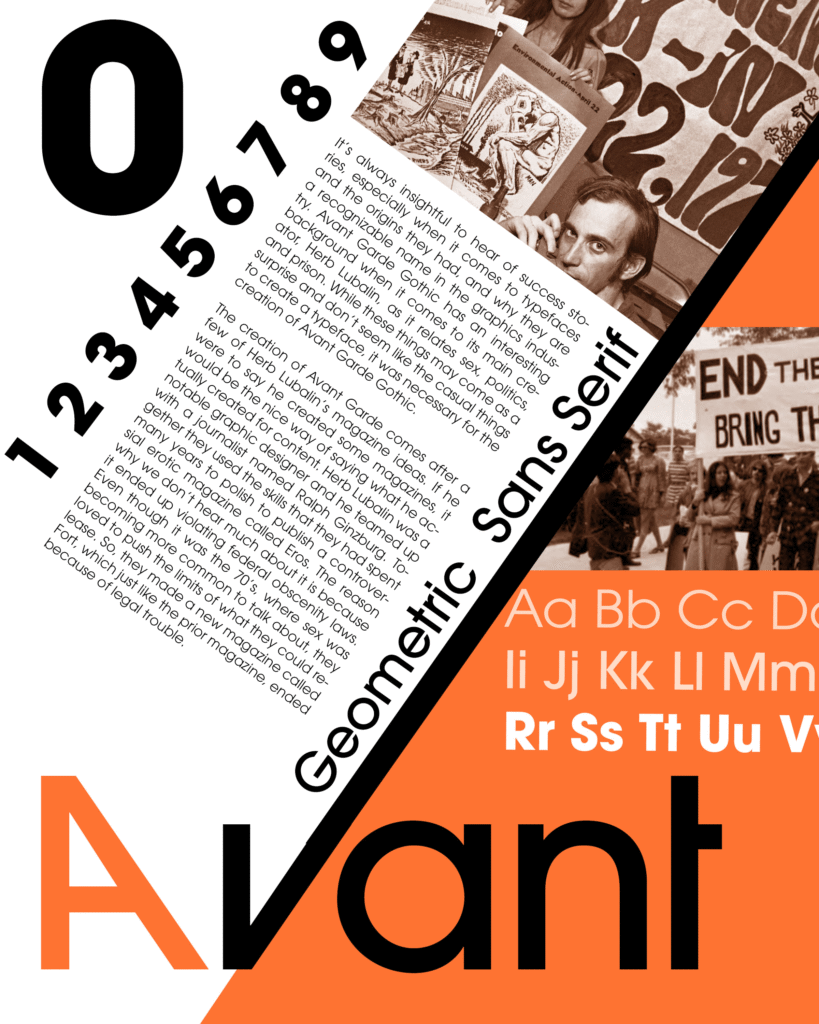
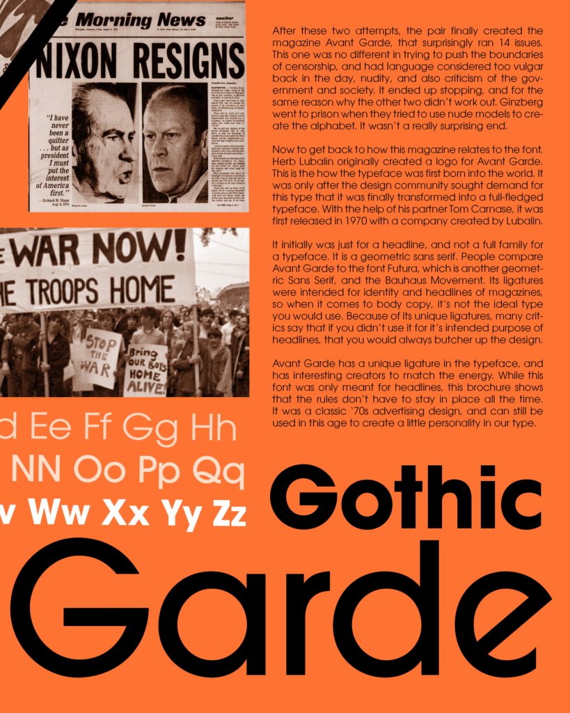
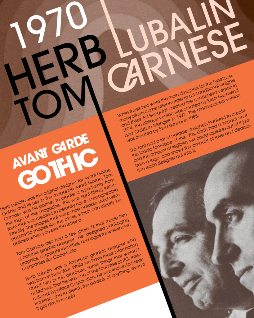
This project explores the bold geometry of the Avant Garde typeface, originally designed in the 1970s. After researching its history and evolution, I crafted a modern brochure that celebrates its iconic structure, using sharp angles and tight kerning to emphasize its typographic rhythm. The orange color choice references its era of origin, paying homage to the visual energy of 1970s editorial design. Through this assignment, I developed a deeper appreciation for geometric and headline-driven typography—Avant Garde became the spark that led me to fall in love with structured, expressive type. The layout balances type and image in a way that’s both nostalgic and contemporary, spotlighting how timeless design can still feel fresh.